Apfelkuchen
Members
-
Joined
-
Last visited
-
Fantastic work!
-
Agreed, they look awesome
-
-
-
Nice " GeForce GTX 980 Ti
-
-
-
-
-
Apfelkuchen replied to Leeghoofd's post in a topic in HWBOT Development: bugs, features and suggestionsAlready fixed, wow! That was fast work
-
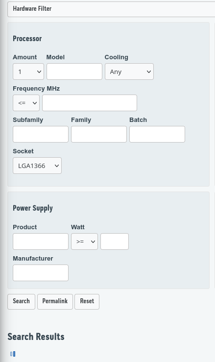
Apfelkuchen replied to Leeghoofd's post in a topic in HWBOT Development: bugs, features and suggestionsLimiting Processor Amount to 1 in any benchmark search seems to hang the search forever. As an example, looking for all wprime32 scores on Socket LGA1366 with 1 CPU: Another point of feedback, is there a reason the hardware filters are hidden until you click them? I don't think I've ever used the result search without wanting to apply a filter, so it's just an extra click for me every time.
-
Apfelkuchen replied to Leeghoofd's post in a topic in HWBOT Development: bugs, features and suggestionsI never saw the beta invitation on discord and I'm fairly active there, I would have loved to check it out Maybe a post in the discord announcement channel with ping would be good next time you have a similar call to action.
-
Apfelkuchen replied to Leeghoofd's post in a topic in HWBOT Development: bugs, features and suggestionsThis, plus I keep clicking on people's names rather than scores now because the clickable score links are so far away to the right and the colours are all the same; the old layout had User/Benchmark in one colour, and result link in another, which might help differentiate.
-
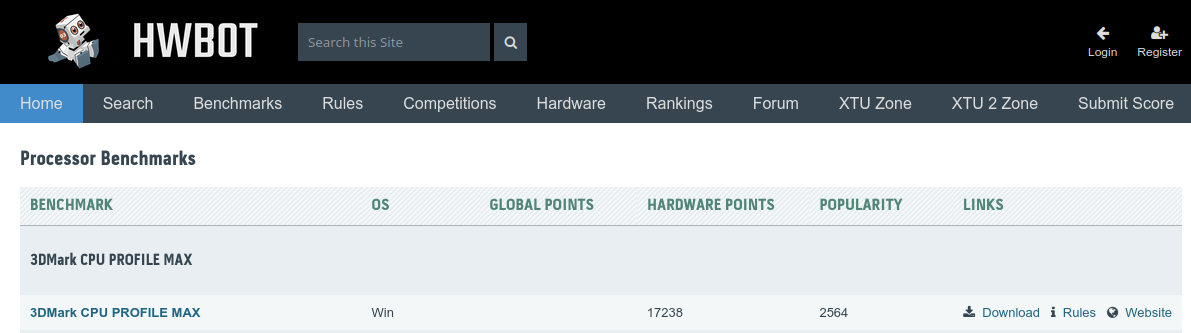
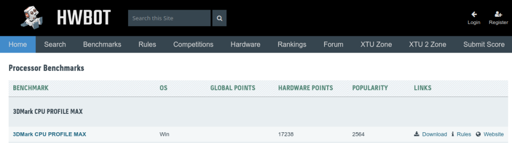
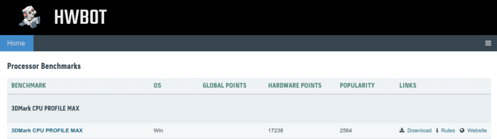
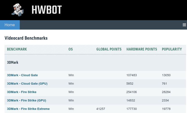
Apfelkuchen replied to Leeghoofd's post in a topic in HWBOT Development: bugs, features and suggestionsSome already mentioned it, but the font sizes are very inconsistent and the fonts themselves uncomfortable to read. The advanced submission search has very small font while the results have relatively large but very slim font, and the text is in weird contrast ratio. Modern sites are usually made with changing window width in mind, which also helps immensely with not needing vastly different pages for mobile. This site does not seem to be built with this concept in mind. This is particularly bad on mobile ofc, but on desktop as well, especially once any table is involved. There is a lot of space that doesn't trunkate on smaller width, and instead just cuts off any table to the right. That makes it very annoying to use on smaller or halved screens. Smaller width also breaks the top bar. For example here is the top of the Processor benchmarks table at ~1200px width, displaying the top bar correctly: And here is the same page when viewed on a window slightly smaller than 1200px: This makes the page extremely annoying to use on a halved 1920x1080 screen. It gets even worse once windows get smaller; it should clearly prioritize keeping the important data on screen, such as still having the download and rule links. But instead there is priority on keeping every cell full intact first, which means: -Titles not shrinking, so for example GLOBAL POINTS stays at full length with huge space waste -Cells not shrinking, so the OS section takes up a huge amount of space when links are already full cut off As an example of things not being properly prioritized and leaving tons of whitespace while leaving out important content, at 770ish px vs 980px There is also no relative ranking section on mobile, only the button to go to full rankings for the benchmark. I have to be honest here, this is a very disappointing first showing. The core principles are missing out on at least 10 years of web design evolution. It's still the same old webdesign practises with a slightly changed (less readable) look and of course a whole host of different new problems to iron out. The latter is fair and expected of course. But I don't see any issues this addresses so far, in fact without exaggeration some pages actually hurt my eyes, such as the font size mismatches on the search or competition pages. You can iron those out; but it will still be just as outdated of a site design as it was before, since it still isn't properly responsive to browser size. I think this needs a major rethink and not just detail changes.

-