Leaderboard
-

Leeghoofd
Crew7Points13490Posts -
shar00750
Members7Points2178Posts -
saltycroissant
Members6Points532Posts -
.jpg.63e5e215aba9ddfbc1aabba3ab29d826.jpg)

SparkysAdventure
Members5Points2017Posts
Popular Content
Showing content with the highest reputation since 05/01/25 in all areas
-
saltycroissant's 6416.3 MHz Memory Frequency run with DDR5 SDRAM
3 points
- ObscureParadox's 4820.22 MHz CPU Frequency run with Pentium 4 2.0Ghz (Northwood)
Thanks guys It's just a good old fashioned volt modded board, I tried Antinomy's bios on it but had a whole lot of memory related issues, so going to try again sometime with the stock Asus bios. Voltage was 2.03v at -140c, any colder and I lost stability, Northwood seems to have FSB issues when too cold.2 points- EVGA Z490 XOC Bios/Tools
2 pointsThe tool is for ratio, bclk, and vcore on XP. btw, can you re-send me your XP image?2 points- EVGA Z490 XOC Bios/Tools
2 points2 points- EVGA Z490 XOC Bios/Tools
2 points@Luumi Finally sent me the XP OC Tool shown in his post here: So, I've made a new Google drive backup including all relevant bioses and tools I've saved. https://drive.google.com/file/d/1u4YPtDfhKwE_SQlEyAPmGQ4PTM0ESOQi/ Hopefully, I'll update this further after I have a board again, but that may not be for a while.2 points- Restrictions for Y-Cruncher 0.8.6
2 pointsI think that is a great way of stating it! And no one got shit on. Jesus Christ, you are getting softer with age.2 points- 3DMark is on SALE !
1 pointGuys i think its time to spend some money Official Website: https://www.3dmark.com/ 3DMark https://store.steampowered.com/app/223850/3DMark/ PCMark10 https://store.steampowered.com/app/524390/PCMark_10/1 point- AKM's 137109 MIPS 7-Zip run with Ryzen 5 9600X
1 point- AKM's 137109 MIPS 7-Zip run with Ryzen 5 9600X
1 point- AKM's 137109 MIPS 7-Zip run with Ryzen 5 9600X
1 point- AKM's 137109 MIPS 7-Zip run with Ryzen 5 9600X
1 point- AKM's 137109 MIPS 7-Zip run with Ryzen 5 9600X
Excellent score amigo Aaron , huge ... well done ! *** sorry for the multiple post , something is wrong with the forum posting as it is slow and reposting the same thing many times. Not trolling. @Leeghoofd check the forum why is acting weird and slow. Thanks ***1 point- AKM's 137109 MIPS 7-Zip run with Ryzen 5 9600X
1 point- AKM's 137109 MIPS 7-Zip run with Ryzen 5 9600X
1 point- AKM's 137109 MIPS 7-Zip run with Ryzen 5 9600X
1 point- Sweet's 3 min 52 sec 197 ms GPUPI for CPU - 1B run with Pentium Gold G7400
Un alago viniendo de Uds. maestro @chispy, grracias1 point- AKM's 137109 MIPS 7-Zip run with Ryzen 5 9600X
1 point- Asus Maximus IX Apex and Coffee Lake Cpu's !
If you don't know how to rename files you probably shouldn't be using flashback to flash the BIOS, there is some risk involved.1 point- HWBOT X-265 RULES DISCUSSION THREAD
Looking at the issues you had to just enable the HPET it is all probably related to your Windows installation, not much we can do about it. This benchmark has been running smooth for ages on win7/8/8.1/10 and 111 point- AKM's 135565 MIPS 7-Zip run with Ryzen 5 9600X
1 point- safedisk's 136129 MIPS 7-Zip run with Ryzen 5 9600X
1 point- AKM's 135565 MIPS 7-Zip run with Ryzen 5 9600X
1 point- AKM's 46 sec 272 ms GPUPI for CPU - 1B run with Ryzen 5 9600X
Wow, that's a really strong one, congrats!1 point- RIP Alexey Shubin aka Traktor
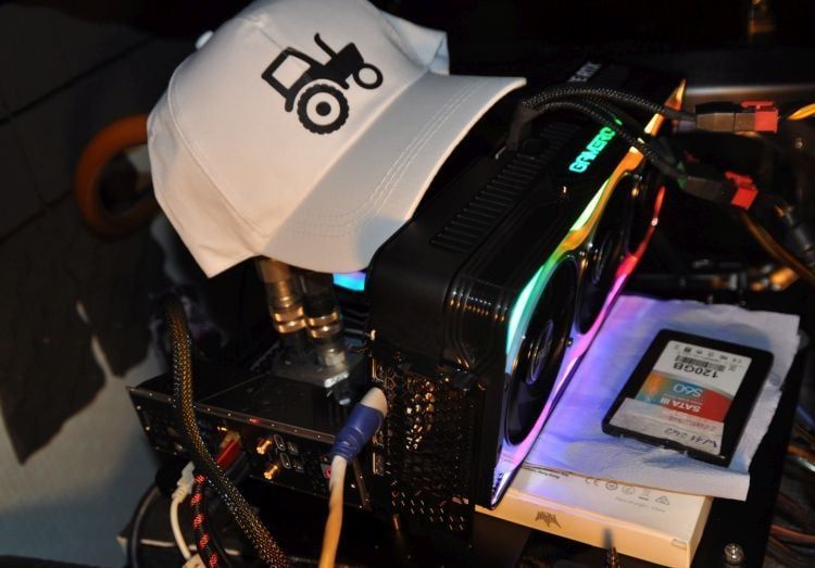
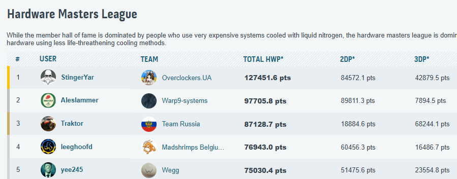
1 pointOn April 22, 2025, one of Team Russia's key members, Alexey Shubin, better known as Traktor, passed away. He joined the HWBot overclocking community in 2015 and rapidly progressed from air cooling to LN2 benching. Ultimately, Traktor found his true calling in Hardware Points overclocking, preferring the calm and steady pace of chilled-water benching at home. With persistence and without rushing—true to his nickname "tractor"—over the course of 10 years, he benched more hardware than most people could manage in several lifetimes. As a result, with over 2000 gold cups, Traktor achieved third ranking in the HWBot Hardware Masters league among more than 200,000 overclockers worldwide, and he was first in the world in 3D Hardware Points. Traktor had a congenital heart condition, which he attempted to treat at the age of 44, but unfortunately without success. Complications arose during his heart surgery, resulting in irreversible damage. Doctors managed to restart the "Traktor’s engine," but sadly, Alexey passed away a little over ten days later without ever regaining consciousness. On behalf of Team Russia and the entire HWBot overclocking community, we deeply mourn this loss. We knew Alexey as a joyful, cheerful, cultured, and polite person who was always ready to lend a helping hand. That is how we will always remember you. Rest in peace, friend! Vlad Zakharov aka slamms Team Russia1 point- AKM's 33.24 fps HWBOT x265 Benchmark - 4k run with Ryzen 5 9600X
1 point- TerraRaptor's 78817 marks 3DMark2001 SE run with GeForce 7600 GT PCIE GDDR3
1 point- AKM's 135565 MIPS 7-Zip run with Ryzen 5 9600X
1 point- Asus Maximus IX Apex and Coffee Lake Cpu's !
1 point- Asus Maximus IX Apex and Coffee Lake Cpu's !
For any of you that are still playing around with this board there is an updated Dsanke bios available ver 2701. Wanted to thank Dsanke for his hard work and personal time spent making this mod. Thank you. Dsanke Apex IX/X 2701 Bios release1 point- chispy's 29743 marks 3DMark - Time Spy Extreme run with GeForce RTX 5090
1 point- looze's 1671 MHz Memory Frequency run with DDR3 SDRAM
Amazing achievement, probably the biggest on 1366 since 300 BCLK fell.1 point- looze's 1671 MHz Memory Frequency run with DDR3 SDRAM
X58a-oc (being the only board capable of overriding the 2:3 imc:dram limit) is nightmare compared to Asus. At least for me.1 point- suzuki's 5823.2 MHz Memory Frequency run with DDR5 SDRAM
1 point- OGS's 69123 marks 3DMark - Fire Strike Extreme run with GeForce RTX 5090D
1 point- PLEASE ADD OTHER HARDWARE THREAD:
1 point- TAN YANG's 4373.58 MHz CPU Frequency run with Core 2 Quad Q8300
Nice one with Asus P45, how high would it clock C2Q FSB ambient ?1 point- AKM's 78.713 fps HWBOT x265 Benchmark - 4k run with Ryzen 9 9950X
1 point- Splave's 40 sec 425 ms GPUPI v3.3 - 32B run with GeForce RTX 5090
Where's the dislike button? Copilot button on a benching O.S. is a crime against humanity 😆1 point- MickaShuBL's 2 min 59 sec 121 ms SuperPi - 32M run with Core i9 14900KF (8P)
No, it's a plate they made for the Galax 5090 HoF just for the sponsored.1 point- AKM's 78.713 fps HWBOT x265 Benchmark - 4k run with Ryzen 9 9950X
The little HDV keeps on giving !1 point- AKM's 78.713 fps HWBOT x265 Benchmark - 4k run with Ryzen 9 9950X
1 point- AKM's 78.713 fps HWBOT x265 Benchmark - 4k run with Ryzen 9 9950X
3600Mhz Sync UCLK/Mem on 140$ board YES!1 point- AKM's 78.713 fps HWBOT x265 Benchmark - 4k run with Ryzen 9 9950X
1 point- chispy's 24333 points Unigine Superposition - 8K Optimized run with GeForce RTX 5090
Thanks amigo Kaliz.1 point- Skylake 6700K/6600K Batch and Serial Numbers
6600K delidded air cooling,5g 4.8 r11.5 1.263v on mocf1 point- Benchmark Tweak software 2024
1 pointCopy the link and paste it into a Microsoft EDGE browser. Chrome and Firefox do not support downlaod anymore from our hosting site, we are working on a fix AMD A64 Tweaker A64Tweaker.exe A64Tweaker_V0.6beta.zip APU Tuning Utility APU+Tuning+Utility.zip AMD MSRTweaker MSRTweaker.zip AMD Overdrive AMD+Overdrive.zip AMD Ryzen Master AMD+Ryzen+Master.zip AMD64 Clock Utility AMD64+Clock+Utility.zip AMD CPUID & CPU Info amdcpuid.exe amdcpuinfo.exe AMD Tool 1.0A Amdtool+1.0a.rar BD patch & Conditioner ( STILT tools ) BDx86 2Bx64patch.zip BDC_R1.03B.zip BDC29.zip AMD Dothan Clockgen dothan+clockgen+eist.rar AMD Ryzen DRAM Calculator DRAM Calculator for Ryzen.zip AMD HDBC HDBC_V1.61.zip AMD KSTAT K10STAT091.rar K10STAT154.rar K15TK.zip AMD Llano CPU errata LlanoCPUerrata665_v1.2.zip AMD Phenom 2 Tweaker phenom2_tweaker.zip AMD PSCheck 3.4.1 PSCheck+3.4.1.rar AMD STILT EXTREME (more info in link) APU Fuse interpreter APU Fuse Interpreter.zip BullDozer Conditoner Bulldozer Conditioner.zip Devastator Powertune Devastator PowerTune.zip Trinity Control Interface K2 Trinity Control Interface.zip Copy the link and paste it into a Microsoft EDGE browser.1 point- GIGABYTE Z790 Aorus Tachyon
1 pointX7T bios have problems with microcode switching, this is why I`ve removed that all and just let X7U online. It´s same like X7T but without any problems during microcode switch1 point- G.Skill World Cup Live Qualifier 2025 (20/05 till 22/05 2025)
ROG MAXIMUS Z890 APEX Special bios 9904/9905 (From Shamino) *Enable Runtime BCLK Button before Memory Training instead of after. These Apex BIOSes specifically targetted towards benchers. 9904 contains the exact same ME as 1603 bios 9905 contains the ME version same as 1603 bios with special mod for certain benchmarks. ME going from same version to same version doesnt update so ME update tool for benchmarks is included, can always run tool after BIOS update to be sure. New in BIOS: 1) RSVD2 during LN2 mode when enabled removes the minimum lower cap for certain voltages dynamically. Make sure you set all voltages possible in BIOS first save exit and enable it to go lower than the LN2 floor. Going Off again restores the minimum floor. So example once every volt is set as you want you can flip rsvd2 on, reboot/retry, and if meet crash or need to go safe mode flip rsvd2 off and retry button. 2) Sneak Preview of DIMM FIT Pro... Download1 point- x58 max bootable/max total PCIe
1 pointI have recently (over the past year) been binning boards and CPUs (as well as having others check their CPUs/boards) for maximum BCLK. With Setfsb, most decent Boards are comparable/not gonna be a limiting factor below 300 MHz BCLK, but bootable I ran into some issues on some of my otherwise best boards. Note that >118 PCIe only becomes necessery after ~261 MHz BCLK, so this will be irrelevant for most people. x58a-oc: max bootable 135-136, max in Setfsb ~138 (3 boards tested, comparable results) Rampage II Extreme: max bootable 118-120, max in setfsb ~138 (2 boards tested) Rampage III Extreme: max bootable 118/134, max in setfsb around 135/unknown (2 boards tested) Rampage III Formula: max bootable 118, max in setfsb currently unknown (2 boards tested) x58a-UD7 rev 1: max bootable 133, max in setfsb 135 (1 board tested) EX58-UD3R: max bootable 126, max in setfsb 127 (1 board tested, unmodded) x58 DK T3eH6: max coldbootable 115, max trainable 118, max in setfsb 119.8 (1 board tested) Testing procedure is basically upping PCIe until it no longer boots at ~1.4V or less ICH voltage (upping this to >1.5V brings 1-2 MHz, same for the related PCIe voltage) and then upping in setfsb using the highest bootable setting. All devices not needed disabled off course. If anyone has more boards to add to this list I would be glad. If there is a mod to Asus boards to up the max bootable PCIe clock that would be amazing, because for baseline BCLK they have been reliably higher then the Gigabyte Boards (both x58a-ocs were 2-3 MHz worse at ambient. On Dice I suspect that I was limited by the max bootable PCIe clock holding me back (286 Asus, 287 Gigabyte, note that the E5606 doesn't work on Gigabyte but generally seems 2-3 MHz better) Some boards appear to be able to train max PCIe or scale with ICH/ICH 1.5V Voltages, but those appear to be more of an exception. Thanks for the current state of the list goes to Jokot, Tagg, quiekmew, coldwove, Tapakah and T.Rex There is far more to x58 max BCLK, though it appears to mostly involve binning hundreds of CPUs.1 point- [FS-EU] strong i7 7700k
1 pointHi guys, up for sale my best retail i7 7700k, batch L639G500 pretested by Hazzan at 6750/6450 CBR15. The cpu have a strong IMC, can run 4200c12.11 easy and on avarage retail RGB can run 5ghz at just -50°c good for validation. I've made some stability test using liquid metal between DIE and IHS on Asrock z170m OCF: -5000/4500 mem 4k xmp @1.26v -5100/4500 mem 4k xmp @1.31v -5200/4500 mem 4k xmp @ 1.395v important note on prime95 version, using the last version the ammount of heat and the voltage required for stability are higher. For reference 52/45 on 26.6 require just 1.275v.... CINEBENCH R15 TEST: -5000/4500 mem 4k xmp @ 1.185V -5100/4500 mem 4k xmp @ 1.230V -5200/4500 mem 4k xmp @ 1.280V -5300/4500 mem 4k xmp @ 1.360v -5300/5000 mem 4k xmp @ 1.360v -5400/4500 mem 4k xmp @ 1.485v Cpu is without box but still in waranty: Asking 400€ shipped within EU Payment: paypal as friend or banktransfer Cheers Franco1 point - ObscureParadox's 4820.22 MHz CPU Frequency run with Pentium 4 2.0Ghz (Northwood)


